> ## Documentation Index
> Fetch the complete documentation index at: https://docs.meridian.surf/llms.txt
> Use this file to discover all available pages before exploring further.
# Send a Message
> Send a text message or embed
Using the Send a Message block, you can quickly send messages as Direct Messages, Replies, or regular text messages.
By default, all Send a Message blocks use the full **Messages v2** system.
Choose to notify no one, everyone, or specific roles & people.
## The Message Editor
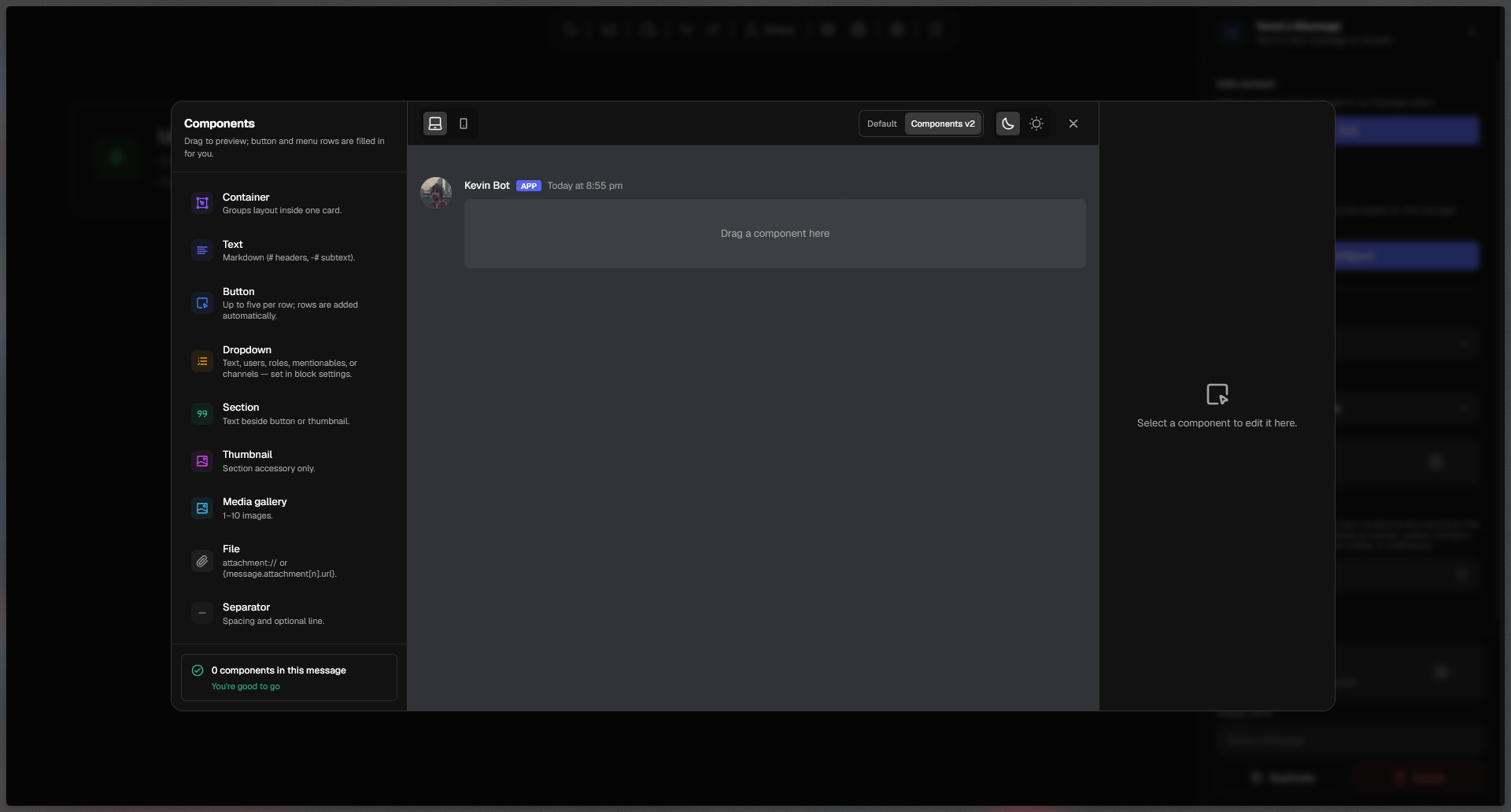
In the message editor, you can drag and drop blocks from the left side onto the canvas, rearrange them, and customize them to your liking.
 ### Switching to legacy (v1) messages
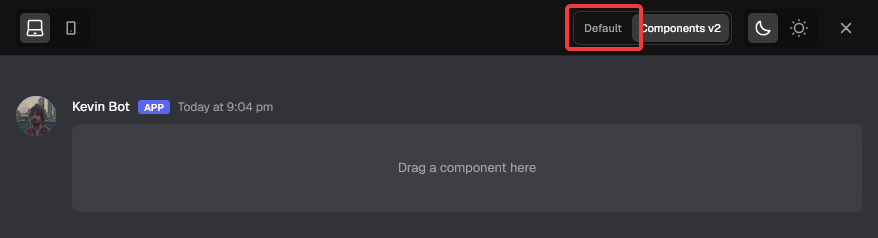
To switch back from Components V2, click on ''Default'' in the upper right corner of the editing space.
### Switching to legacy (v1) messages
To switch back from Components V2, click on ''Default'' in the upper right corner of the editing space.
 You can switch in between the modes at any time.
Please note that switching from Components V2 to Default might delete larger parts of your message due to incompatibility of the components. Switching from Default (Legacy) to Components v2 should cause no issues in most cases.
### Testing your messages on different devices and themes
To save time while writing long messages, you can test out how your messages look on Mobile and PC as well as Dark mode and Light mode right in the editor, before even saving!
You can switch in between the modes at any time.
Please note that switching from Components V2 to Default might delete larger parts of your message due to incompatibility of the components. Switching from Default (Legacy) to Components v2 should cause no issues in most cases.
### Testing your messages on different devices and themes
To save time while writing long messages, you can test out how your messages look on Mobile and PC as well as Dark mode and Light mode right in the editor, before even saving!
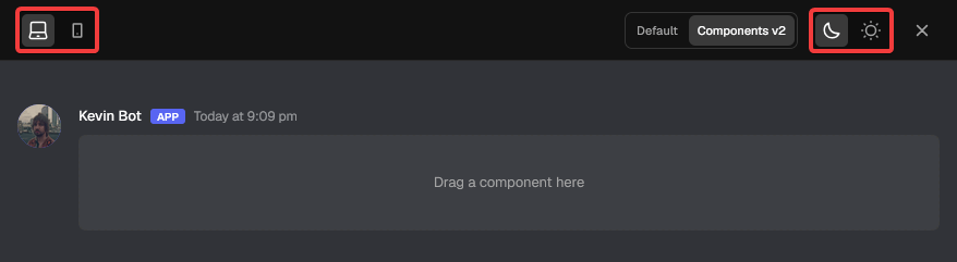 To change devices, use the toggle with the Laptop and Phone icons, located in the upper left corner of the editing space. Using this switch does not affect your message.
To change themes, use the toggle with the Moon and Sun icons, located in the upper right corner of the editing space. Using this switch does not affect your message.
### The components
Components v1
Discord markdown text
Container for text with a color
Interactable Discord buttons
Interactable Discord dropdowns
\*\*Components v2 \*\*Default
Groups layout inside one card
Discord markdown text
Interactable Discord buttons
Interactable Discord dropdowns
Text with a button or image
Used to give the section an image
1-10 Images shown in a grid
An attachment
A line to divide content
### Component Behavior
Every single component can be customized and disabled. Customization options differ for each component.
Disabled components still show up in your editor and can be changed, but will not be displayed in Discord once you run your flow.
To change devices, use the toggle with the Laptop and Phone icons, located in the upper left corner of the editing space. Using this switch does not affect your message.
To change themes, use the toggle with the Moon and Sun icons, located in the upper right corner of the editing space. Using this switch does not affect your message.
### The components
Components v1
Discord markdown text
Container for text with a color
Interactable Discord buttons
Interactable Discord dropdowns
\*\*Components v2 \*\*Default
Groups layout inside one card
Discord markdown text
Interactable Discord buttons
Interactable Discord dropdowns
Text with a button or image
Used to give the section an image
1-10 Images shown in a grid
An attachment
A line to divide content
### Component Behavior
Every single component can be customized and disabled. Customization options differ for each component.
Disabled components still show up in your editor and can be changed, but will not be displayed in Discord once you run your flow.
 Easily create dynamic content by using variables.
#### Emoji Beta
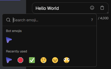
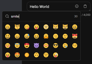
On the text, button and select menu components, emojis can be added using an emoji selector. We're using the same emojis for Discord for your convenience. In addition, the emoji selector is also capable of displaying your bot emojis and emojis from servers your bot is in.
Easily create dynamic content by using variables.
#### Emoji Beta
On the text, button and select menu components, emojis can be added using an emoji selector. We're using the same emojis for Discord for your convenience. In addition, the emoji selector is also capable of displaying your bot emojis and emojis from servers your bot is in.
 ### Four ways to send your message
You can choose if you want your message to be sent as a regular message, reply, edit, or as a DM (Direct Message). Each way comes with their own configuration options.
### Four ways to send your message
You can choose if you want your message to be sent as a regular message, reply, edit, or as a DM (Direct Message). Each way comes with their own configuration options.
 #### Action: Send
Select ''Send'' in the Action dropdown to send your message in any channel your bot has access to, to the channel the command was used in (or event was triggered in) or as a reply to other messages.
After selecting Send in the Action dropdown, another dropdown pops up: **Destination**:
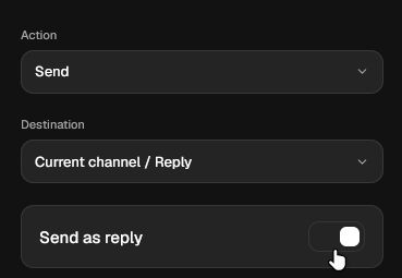
If you choose **Current channel / Reply**, you will see a Send as reply toggle, which when toggled sends your current message as a reply to the triggering message by default, if not toggled, your message will just be sent normally to the current channel.
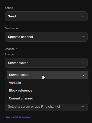
If you choose **Specific channel**, you can choose the source from four available options:
* Server picker
* Variable
* Block reference
* Current channel
#### Action: Direct Message
In the same Action dropdown, select ''Direct Message'' to send the message any applicable user's private messages as the bot.
#### Action: Send
Select ''Send'' in the Action dropdown to send your message in any channel your bot has access to, to the channel the command was used in (or event was triggered in) or as a reply to other messages.
After selecting Send in the Action dropdown, another dropdown pops up: **Destination**:
If you choose **Current channel / Reply**, you will see a Send as reply toggle, which when toggled sends your current message as a reply to the triggering message by default, if not toggled, your message will just be sent normally to the current channel.
If you choose **Specific channel**, you can choose the source from four available options:
* Server picker
* Variable
* Block reference
* Current channel
#### Action: Direct Message
In the same Action dropdown, select ''Direct Message'' to send the message any applicable user's private messages as the bot.
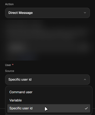
After selecting Direct Message in the main Action dropdown, a new Source dropdown appears, allowing you to additionally choose if you want to send the Direct Message to:
* Command User
* Variable
* Specific user id
 ### Notifications
On Meridian, notifications your messages trigger can be fully customized to your desire.
### Notifications
On Meridian, notifications your messages trigger can be fully customized to your desire.
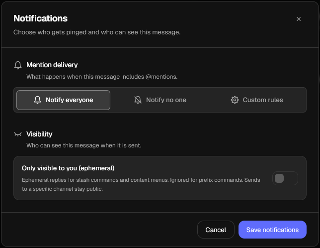 #### Mention Delivery
Using this setting, you can customize allowed mentions for your message. By default, this is set to Notify everyone. You can also select Notify no one or Custom rule for full customization.
Everyone you mention gets notified
No one gets notified by the message
Customizable notifications
Please note that Mention Delivery can only be configured for **v2 Messages**.
#### Custom Mention delivery
#### Mention Delivery
Using this setting, you can customize allowed mentions for your message. By default, this is set to Notify everyone. You can also select Notify no one or Custom rule for full customization.
Everyone you mention gets notified
No one gets notified by the message
Customizable notifications
Please note that Mention Delivery can only be configured for **v2 Messages**.
#### Custom Mention delivery
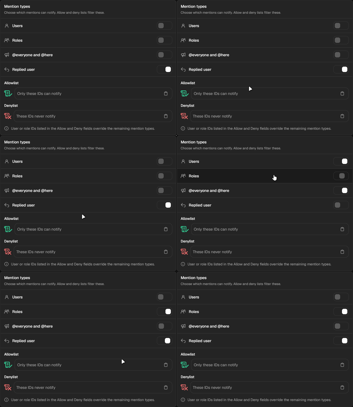
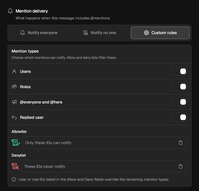 **TIP:** You can hold Shift + Left mouse button and drag your mouse over the options to toggle them together.
 When you select Custom Rules in the Mention delivery setting, the modal expands to fit the additional mention settings, which include:
* Users
* Roles
* @everyone and @here
* Replied user
* Allowlist
* Denylist
The Allowlist and Denylist override all other settings.
Hover over each setting to read more about what it does.
### Variables produced by the Send a Message block
The Send a Message block produces a single `{message}` or `{message_n}` (where `n` is the serial number of the Send a Message block, ex. 2). When called, the variable returns the Discord message ID corresponding to the block's configured message after it's sent.
By default, the single `{message}` variable is always populated by the Send a Message block connected to the Error Handler block.
The `{message}` variable shouldn't be confused with the `{interaction.message.content}` variable which returns the content of the triggering message (if applicable) for events.
The `{message}` variable can be customized to be custom text inside \{curly brackets}.
### Buttons
Buttons can be created, edited, rearranged and deleted in the Send a Message block's message editor.
When you select Custom Rules in the Mention delivery setting, the modal expands to fit the additional mention settings, which include:
* Users
* Roles
* @everyone and @here
* Replied user
* Allowlist
* Denylist
The Allowlist and Denylist override all other settings.
Hover over each setting to read more about what it does.
### Variables produced by the Send a Message block
The Send a Message block produces a single `{message}` or `{message_n}` (where `n` is the serial number of the Send a Message block, ex. 2). When called, the variable returns the Discord message ID corresponding to the block's configured message after it's sent.
By default, the single `{message}` variable is always populated by the Send a Message block connected to the Error Handler block.
The `{message}` variable shouldn't be confused with the `{interaction.message.content}` variable which returns the content of the triggering message (if applicable) for events.
The `{message}` variable can be customized to be custom text inside \{curly brackets}.
### Buttons
Buttons can be created, edited, rearranged and deleted in the Send a Message block's message editor.
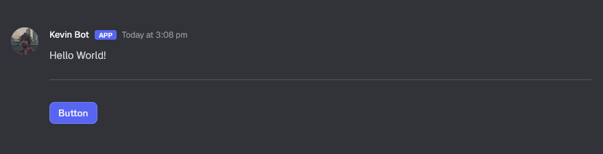 By default, dragging in a button component from the components on the left panel will create a Row component, and automatically place your button inside.
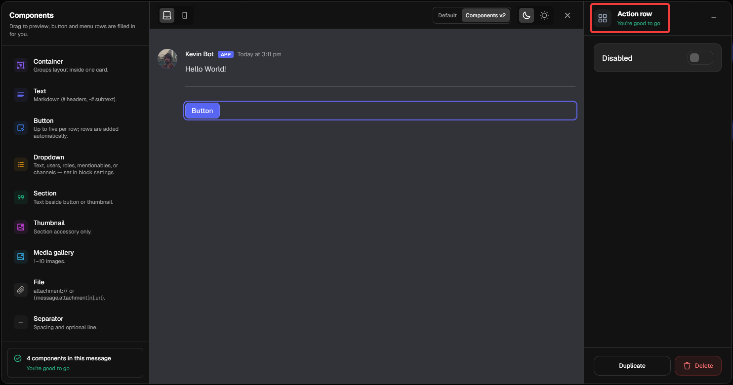 Therefore, when clicking anywhere around a button, you will not edit the button itself but rather the row. A row can be Duplicated, Disabled or Deleted, directly affecting all components inside of the row.
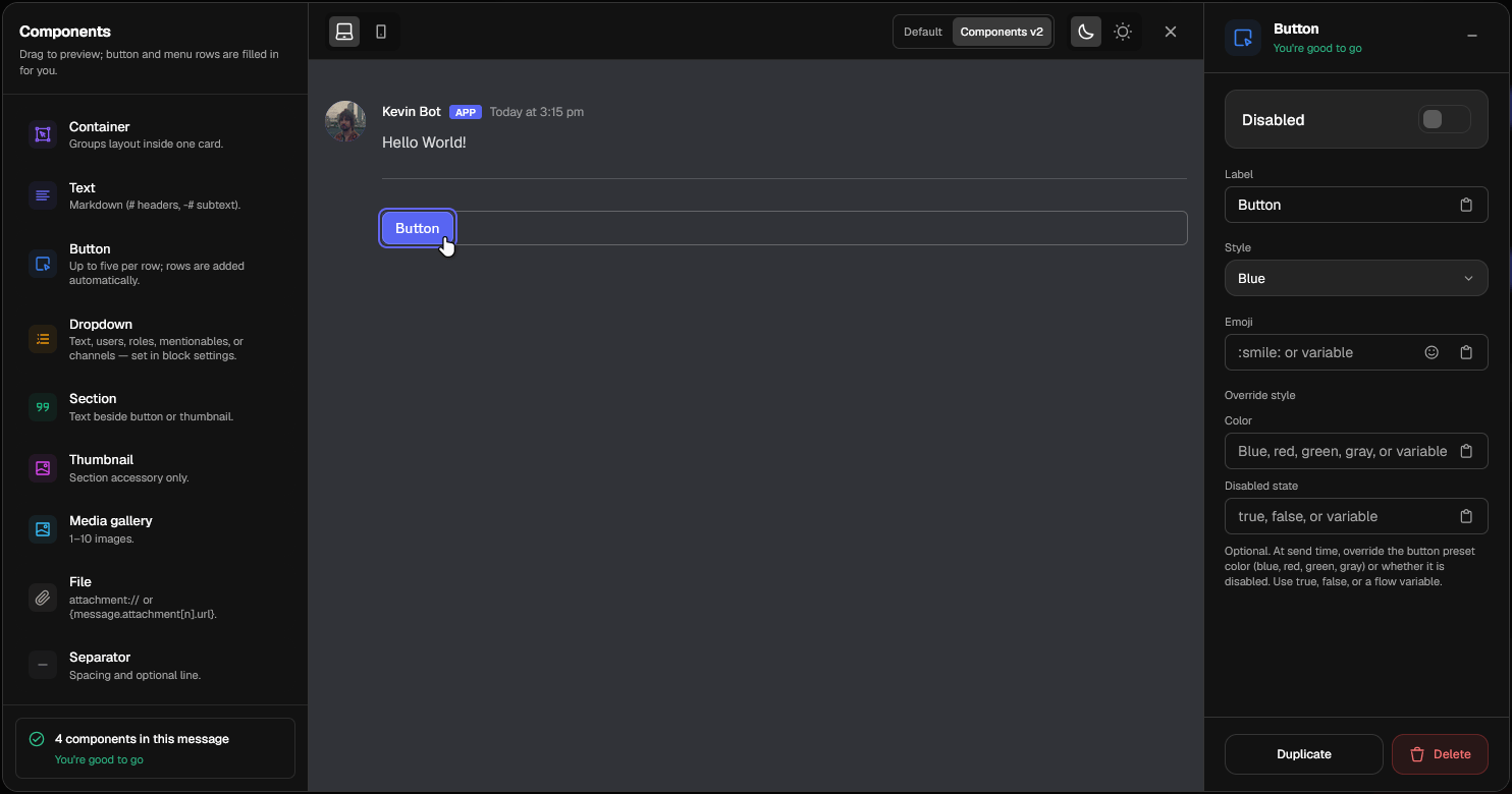 To actually edit a button, you must click on the button itself. Every button can individually be modified with the following settings: Disabled / Enabled, Label and Emoji.
In addition, Overrides can be added by using variables. If an override is invalid, the button will automatically fallback to the manual inputs you set.
Override styles override all manual settings.
Supported button colors include:
If a button has emojis, it will display them to the left side of the text on Discord once the message is sent.
In Meridian:
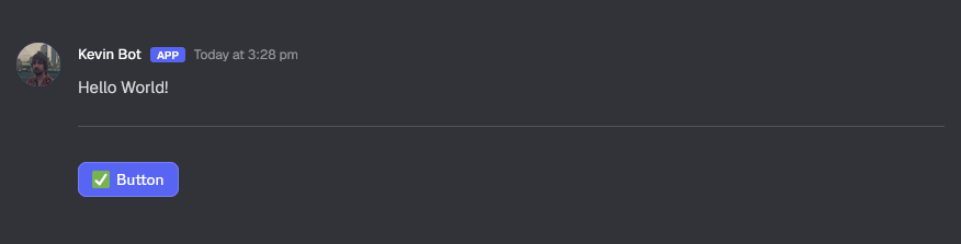 In Discord:
 To add more buttons, simply drag them in any valid position.
sudg--9612.png?fit=max&auto=format&n=2Yf2FVPqmBmd-PU6&q=85&s=79c586aac9903e69158292779a1d3611) What each color means:
| Color | Meaning |
| :---------------------------------------: | ------------------------------------------------------------------------------------------------------------------------ |
| Blue | This is a possible position. You can try placing a component here. |
| Green | This specific component can also be placed in this position. Release component to place it here. |
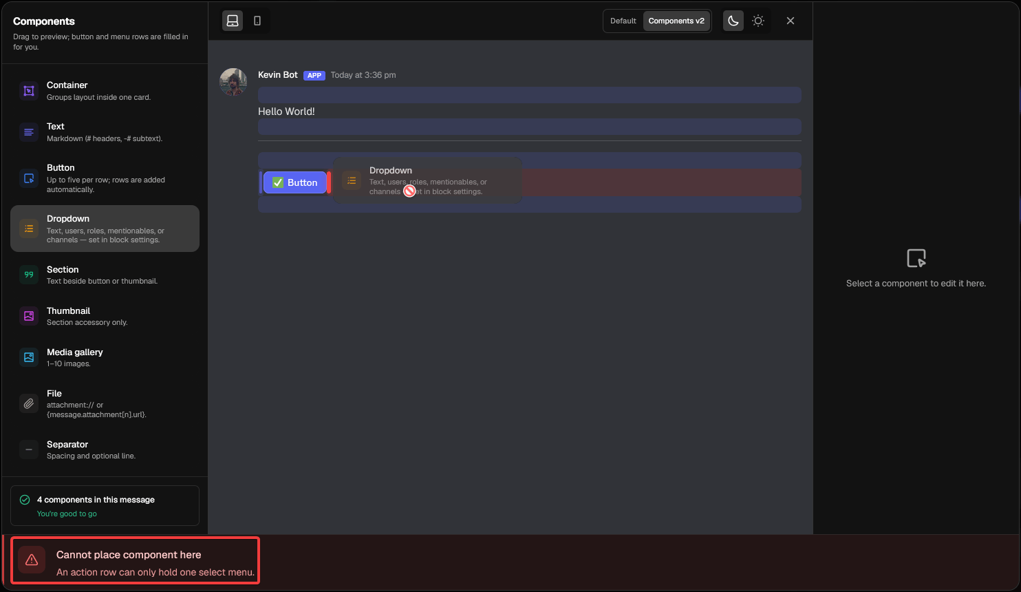
| Red | This specific component can't be placed in this position. Move it elsewhere or release it here to cancel it's placement. |
When attempting to place a component in an invalid position, you the blue area will become red and an error message will slide in from the bottom of the message editor to explain why that is an invalid position.
What each color means:
| Color | Meaning |
| :---------------------------------------: | ------------------------------------------------------------------------------------------------------------------------ |
| Blue | This is a possible position. You can try placing a component here. |
| Green | This specific component can also be placed in this position. Release component to place it here. |
| Red | This specific component can't be placed in this position. Move it elsewhere or release it here to cancel it's placement. |
When attempting to place a component in an invalid position, you the blue area will become red and an error message will slide in from the bottom of the message editor to explain why that is an invalid position.
 After adding at least one button in your message, it will appear in the builder after you leave the message editor.
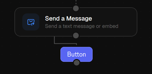 To wire other blocks to run after a button press, you simply connect them to the button's Handle. Of course, if you'd like, you can still wire actions to happen directly after the Send a Message block's message has been sent, using its own Handle.
### Dropdowns
Much like buttons, dropdowns can also be placed, edited, moved and deleted directly in the message editor.
To wire other blocks to run after a button press, you simply connect them to the button's Handle. Of course, if you'd like, you can still wire actions to happen directly after the Send a Message block's message has been sent, using its own Handle.
### Dropdowns
Much like buttons, dropdowns can also be placed, edited, moved and deleted directly in the message editor.
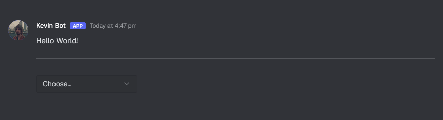 By default, dragging in a dropdown component from the components on the left panel will create a Row component, and automatically place your dropdown inside.
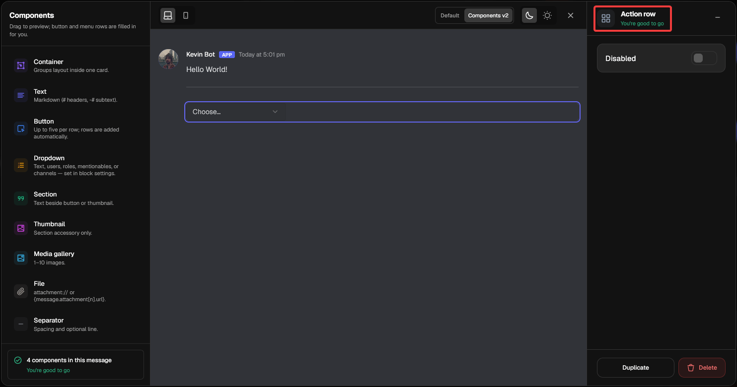 Therefore, when clicking anywhere around a dropdown, you will not edit the dropdown itself but rather the row. A row can be Duplicated, Disabled or Deleted, directly affecting the dropdown inside.
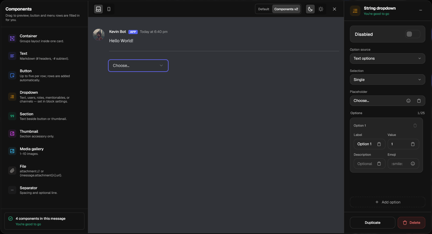 Click on the dropdown itself in order to edit it. Every dropdown can individually be modified with the following settings:
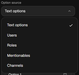 Hover over any option source in the list to the right to find out more about it.
#### Option Source
Using the option source dropdown, you can configure the type of options the dropdown displays in Discord. Available options:
* Text options
* Users
* Roles
* Mentionables
* Channels
#### Selection
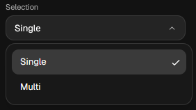
The selection dropdown lets you choose if the user can choose only one option, or multiple.
Soon You will be able to configure a min-max range of how many selections can be made.
Soon You will be able to override the selection dropdown with variables, like the button styling options.
Hover over any option source in the list to the right to find out more about it.
#### Option Source
Using the option source dropdown, you can configure the type of options the dropdown displays in Discord. Available options:
* Text options
* Users
* Roles
* Mentionables
* Channels
#### Selection
The selection dropdown lets you choose if the user can choose only one option, or multiple.
Soon You will be able to configure a min-max range of how many selections can be made.
Soon You will be able to override the selection dropdown with variables, like the button styling options.
 **Beta Feature:** We are working hard on improving this feature, so you might see a lot of Soon tags. If you have feedback or any suggestions, you are more than welcome to provide them in our [Discord](https://discord.gg/V4kdj8umeR).
 #### Placeholder
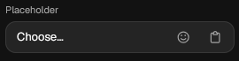
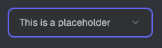
The placeholder is a customizable string with support for emojis and variables that shows before the user opens the dropdown.
#### Options
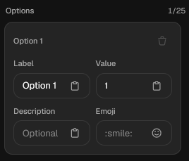
Options are customizable string items that are shown in the dropdown on Discord if you enable Text options in Option Source. For each option, you can customize:
* The Label
* The Value
* The Description Optional
* The Emoji Optional
Soon Soon, you'll be able to rearrange options.
#### Placeholder
The placeholder is a customizable string with support for emojis and variables that shows before the user opens the dropdown.
#### Options
Options are customizable string items that are shown in the dropdown on Discord if you enable Text options in Option Source. For each option, you can customize:
* The Label
* The Value
* The Description Optional
* The Emoji Optional
Soon Soon, you'll be able to rearrange options.
 Hover over any entry in the list on the left to read more about the hovered item.
For every dropdown, you can have up to **25** **options**.
#### Getting user input from dropdowns
Soon
Hover over any entry in the list on the left to read more about the hovered item.
For every dropdown, you can have up to **25** **options**.
#### Getting user input from dropdowns
Soon